Home › Forums › The Japanese Language › Extra kana practice with different fonts
This topic contains 8 replies, has 4 voices, and was last updated by MisterM2402 [Michael] 12 years, 3 months ago.
-
AuthorPosts
-
April 2, 2014 at 11:34 am #44712
Hey guys. It’s nearly a year ago that I started with hiragana and katakana, so I feel pretty comfortable with them by now–as long as they look like they normally do for plain printed or screen text. But when I see something in an unusual style, be it calligraphic or drawn with as few lines as possible, or old pixel-limited computer fonts, I sometimes come up short. So I thought it would be a good idea to additionally study with some of these.
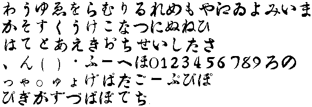
Today I started by ripping the font from Final Fantasy V, a 1992 Super Famicom game. Other than the dakuten/handakutens, characters are limited to 7×7 pixels. For purposes of being a decent size on most screens I blew them up to 20x original size.
Here are the Anki decks I created from it:
Final Fantasy V Hiragana
Final Fantasy V KatakanaI just went with the standard options listed on the character naming screen. So no combinations like じゃ, though じ and ゃ are listed separately. There were also a few characters present in katakana that weren’t for hiragana: ヴァェィォゥ.
April 2, 2014 at 1:48 pm #44715http://www.realkana.com/options/
You can choose to practise kana in different fonts on realkana already. Those are some of the more common styles, I think.
I’m not sure I see why you’d want to have flash cards of unusual kana fonts. The fact that they are “unusual” means you’re not going to have to see them all the time, so they’re not something you need to specifically practice. Yeah, sometimes I see text in weird fonts and I think “What the heck is that one supposed to be?”, but if I manage to figure it out then I know for the next time I see it (if ever). It’s one of these things you have to take on a case-by-case basis as fonts can sometimes be drastically different, although you do get better at guessing over time.
As for the text “drawn with as few lines as possible”, I don’t see what’s weird about that one, it looks fairly standard. Well, they’re not too hard to guess, at least.
Good effort though, don’t get me wrong :D Maybe it will be more helpful to other people. It’d be cool to actually see a picture of the fonts you ripped – most of the examples on Google Images show a remake of the game, with nice smooth, hi-def fonts.
April 2, 2014 at 2:19 pm #44717Says ナッチ.
I do hear you on pixel-limited computer fonts, though. Been a struggle reading the furigana in 二ノ国, but I’m getting the hang of it now.
The fact that they are “unusual” means you’re not going to have to see them all the time, so they’re not something you need to specifically practice.
Actually, they’re pretty much all over the place. A-like so.
Saw ads on the side of a bus when I was in Japan that had a character with two little horizontal lines next to a vertical line with a slight hook, and I was staring at it going “… is that supposed to be シ or ツ?” In hindsight, it was probably シ, and those are tricky to tell apart anyway, but still. Don’t underestimate ad designers’ abilities to come up with new and fascinating fonts. =P
April 3, 2014 at 10:52 am #44735http://www.realkana.com/options/
You can choose to practise kana in different fonts on realkana already. Those are some of the more common styles, I think.
Ahh, thanks, that should be helpful.
I’m not sure I see why you’d want to have flash cards of unusual kana fonts. The fact that they are “unusual” means you’re not going to have to see them all the time, so they’re not something you need to specifically practice. Yeah, sometimes I see text in weird fonts and I think “What the heck is that one supposed to be?”, but if I manage to figure it out then I know for the next time I see it (if ever). It’s one of these things you have to take on a case-by-case basis as fonts can sometimes be drastically different, although you do get better at guessing over time.
I certainly won’t try to learn a crazy number of styles, but practicing with a few will I think better help me get to what makes a character a character, instead of memorizing things that may not be the same from font to font. Example of this below the next quote.
Saw ads on the side of a bus when I was in Japan that had a character with two little horizontal lines next to a vertical line with a slight hook, and I was staring at it going “… is that supposed to be シ or ツ?” In hindsight, it was probably シ, and those are tricky to tell apart anyway, but still. Don’t underestimate ad designers’ abilities to come up with new and fascinating fonts. =P
When learning katakana, I differentiated all the “smiley face” characters by considering “number of eyes” and “half smile or full smile”. Then I ran across a fixed-height font where all of them appeared “full smile”. I was supposed to use the angle of the “eyes” to tell which character it was supposed to be, but I was lost as I hadn’t been forced to learn it that way.
Another example is き. I didn’t realize the diagonal line and curve didn’t always connect, so when I first ran across that in another old game I was stumped. When I realized what it was I thought it was just something they were forced to do due to how little space they had to make it recognizable, but looking at realkana.com now I see that’s the way it is with a number of fonts.
April 3, 2014 at 2:41 pm #44737さ, ふ, り, む, そ and な also have slight variations between typed and handwritten styles. Mostly down to which strokes are joined up and which ones aren’t.
April 3, 2014 at 3:19 pm #44739@Joel:
“Actually, they’re pretty much all over the place.”
As a whole yes, but each individual font isn’t all over the place. A couple lines down on that Google Image search there’s a Sanyo logo – are you really going to see *that* font in lots of different places? If you made flash cards for that font, would you really get much benefit?
@Joshua:
“Another example is き. I didn’t realize the diagonal line and curve didn’t always connect”
That’s the trouble with learning kana online: computerised fonts can have the characters one way while handwritten fonts can have them another. The “non-connected” version of き is the standard way when writing (though there are computer fonts that have the character like that too).
April 3, 2014 at 3:59 pm #44744If you made flash cards for that font, would you really get much benefit?
Yeah, but you’re also not going to see much benefit from ignoring it either. =P
April 4, 2014 at 10:21 am #44751I think studying different fonts could be really helpful. Although, I would say it makes more sense for kanji than it does for kana, especially if you have had a lot of writing practice through something like RTK.
It helps you to notice general shapes, when the strokes might not look so clear.
http://upload.wikimedia.org/wikipedia/commons/e/e9/Kanji-handwritten2.pngThey may seem obvious to someone who is familiar with kanji, but perhaps not to beginners.
April 4, 2014 at 5:06 pm #44754“Yeah, but you’re also not going to see much benefit from ignoring it either. =P”
So you don’t get benefit either way, meaning it’s either “effort and no benefit” or “no effort and no benefit”. I’d rather take the “no effort” route to getting no benefit ;)
-
AuthorPosts
You must be logged in to reply to this topic.